FIDELITY
The deep navy-blue color of the icon and text conveys trust, stability, and expertise, while the subtle light blue background adds a touch of calmness and modernity. The combination of bold typography for "FIDELITY" and clean, minimal text for "TECHNICAL SOLUTIONS" creates a balanced and polished visual identity. This logo is versatile, making it ideal for both digital and print applications.


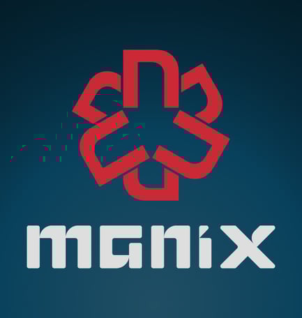
MANIX
Set against a deep teal-to-navy gradient background, this Manix logo captures attention with a powerful blend of modernism and tech-inspired design. The centerpiece—a geometric red brandmark—forms a dynamic star-like shape composed of interlocking segments, symbolizing strength, connectivity, and innovation. Beneath it, the bold white "manix" wordmark in a custom futuristic typeface reinforces a strong digital identity. The contrast between the vivid red, crisp white, and deep background enhances legibility and impact, making this logo ideal for both digital and print applications. Overall, the design communicates reliability, modernity, and forward-thinking—a perfect fit for a technology or hardware brand.
NEWTAKE ENGINEERING
The "Newtake Engineering" logo effectively captures the essence of the company through its modern, geometric design and bold typography. The stylized "N" and "E" create a dynamic and innovative impression, while the bold sans-serif font conveys strength and reliability. The contrasting color scheme ensures that the logo is visually appealing and memorable.
LASCENT
The "LA SCENT" logo elegantly embodies the essence of luxury and sophistication. The refined typography, with its subtle artistic flourishes, evokes a sense of exclusivity and premium craftsmanship. The deep, rich background color enhances the contrast of the golden lettering, creating a timeless and distinguished aesthetic. The delicate interplay of curves and sharp edges in the letterforms reflects the harmony between modern elegance and classic opulence, making it a perfect representation of a high-end fragrance brand. identity.
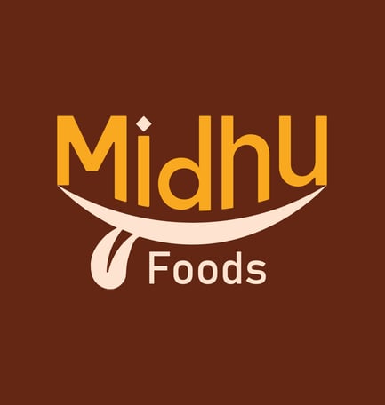
midhu foods
The Midhu Foods logo captures the essence of a vibrant and appetizing food brand through its warm color palette and playful typography. The use of bold, rounded lettering in shades of orange and cream gives the logo a friendly and inviting appearance, perfect for a brand in the culinary space.
The standout element is the curved underline that forms a subtle smile or dish shape, enhanced by a tongue-like detail, creatively symbolizing taste and satisfaction. This clever visual element reinforces the brand's focus on delicious and enjoyable food experiences.